Some of Our Favorite Rebrands of 2019

Changing a brand is expensive and stressful. It may help a company stand out and take it to the next level, it may make a company the butt of jokes, and more often than not, it has little impact on a company’s fortunes despite the huge costs to change. It’s hard work and even just staying organized is a big task, and something for which digital asset management can be critical. We applaud these companies for taking a chance, and in our opinion, doing a great job with rebrands in 2019.
Peace Coffee
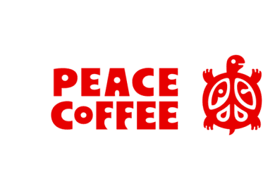
We love, love, love Peace Coffee’s new look. Peace Coffee started in the mid-90s and the original logo has a handcrafted look that appealed to discerning shoppers looking for a small batch, sustainable coffee brand. As the independent coffee market has exploded in the past twenty years, standing out on the shelf has been harder and harder. Peace Coffee has made the leap to a new, modern look, while keeping the spirit that makes Peace Coffee a special company. The turtle, now much cuter, and separated from the wordmark, is more useful across packaging and other designs, and the perfect bright red can’t be missed.
Volkswagen
Since the company’s inception in the 1930s, Volkswagen’s logo has always been a V over a W inside a circle. There have been about a dozen iterations, and this is just the latest. The last look mimicked what someone would see on the cars with a three-dimensional design and varying colors to reflect how light hits a shiny surface. The new version, with a new choice of blue and a flat design, makes the brand current without any possibility of mixing messages.
According to Volkswagen’s press release:
This will be more modern, clearer and simpler. The logo will be reduced to its essential elements and presented with a new design that is flat and two-dimensional. It will allow more flexible use and will be outstandingly recognizable in digital media.
That’s exactly right. We like it.
Manischewitz
Making changes involving the name that is synonymous with Kosher products means taking a major risk. Manischewitz took that risk in 2019 after decades of a logo with four different colors. The new logo recalls the general shape of the original while paring down the complexity to a single, bright orange. Maintaining the general shape and the orange kept it recognizable, but the new logo manages to be both more modern and also more classic. That’s a tough line to walk and we think Manischewitz pulled it off beautifully. This new look has not been added to Manischewitz’s famous Kosher wine and it will be interesting to watch if changes may be coming there as well.
Sir Kensington’s
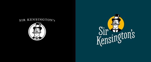
Compared to other brands on this list, Sir Kensington’s is far and away the youngest. Started in 2010, Sir Kensington’s makes condiments with less sugar and without highly processed ingredients like high fructose corn syrup. The brand is based around a quirky British mascot harkening to someone with the highest possible level of taste. In the brand update, the fake Sir Kensington didn’t change much except getting a little pop of color. The wordmark gets a more significant makeover with a rounded serif font that hits the right mix of class and playfulness, just like the Sir Kensington brand overall. We love the new packaging and seeing Sir Kensington’s on more and more shelves. We’re especially happy because they made the commitment to benefit their employees, communities, and the planet by becoming a certified B Corp in 2018, a community that we’ve been a member of since 2014.
